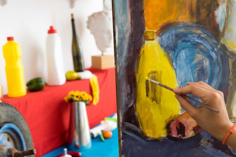
Color is the soul of a painting. It has the ability to set the mood, evoke emotions, and guide the viewer’s attention. In oil painting, mastering color harmony is essential for creating works that feel balanced, expressive, and memorable.
Understanding Color Theory
Before blending pigments on your palette, it helps to understand the fundamentals of color theory:
- Primary Colors: Red, blue, and yellow are the building blocks of all hues.
- Secondary Colors: Orange, green, and purple, created by mixing two primaries.
- Complementary Colors: Opposite hues on the color wheel (e.g., blue and orange) that create vibrant contrast.
- Analogous Colors: Neighboring hues that form natural, calming harmony.
Knowing these relationships helps you predict how colors interact and how they affect the viewer.
Techniques for Achieving Color Harmony
- Limited Palette Painting
- Restrict yourself to a few colors to create unity.
- A limited palette forces creative mixing and ensures consistency across the canvas.
- Glazing with Transparent Colors
- Apply thin, translucent layers over dried paint to enrich depth and luminosity.
- Glazing allows subtle shifts that unify tones.
- Balancing Warm and Cool Tones
- Warm colors (reds, yellows) create energy, while cool colors (blues, greens) add calmness.
- Balancing the two creates depth and emotional equilibrium.
- Strategic Use of Neutrals
- Neutral tones (grays, browns) prevent overwhelming the viewer.
- They make bold colors pop by contrast.
Emotional Impact of Color
Colors speak directly to human emotions:
- Blue: Tranquility, depth, melancholy.
- Red: Passion, intensity, drama.
- Green: Growth, nature, calm.
- Yellow: Energy, joy, brightness.
- Purple: Mystery, creativity, richness.
An oil painter who understands these associations can use color deliberately to tell a story beyond the visible.
Practical Tips for Artists
- Always test mixes on a small canvas before applying to your main work.
- Keep a color journal to record combinations and glazing experiments.
- Observe nature—the ultimate master of color harmony—for inspiration.
- Step back frequently from your canvas to check overall balance.
Color is more than pigment—it is emotion made visible. By mastering harmony, contrast, and temperature, an artist can turn a painting into a powerful, immersive experience. With oil paints’ richness and versatility, the possibilities are endless.